Comprehensive Guide on generating Admixture Graphs using Admixtools2 in R
Admixture graphs allow researchers to model historical admixture events which is particularly useful in hybridization studies to calculate the relative contributions of parental lineages to hybrids. They provide additional insights beyond classic Treemix and f-branch plots. After an extensive search for a straightforward tutorial on generating admixture graphs from genetic variant data yielded little success, I decided to write a comprehensive guide to help integrate this powerful analytical tool into your research.
BIOINFORMATICS
Tim L. Heller
1/27/20244 min read
f2-Statistics
F2-statistics are the basis of admixture graph inference. Hereby, f2-statistics calculate the genetic distance between two individuals and inform about their evolutionary distance. By rendering different tree topologies, these distances are modelled to the node paths and a tree representing the distances most optimally can be concluded.
Installation
The simplest way to use admixtools2 is by employing the R-package and running it on your local computer. While I was attempting install the admixtools library on our Linux cluster, I failed miserably due to its renowned conflicts with conda environments. Fortunately, the required input files are compact and run efficiently.
Start by installing devtools to download and compile the repository
install.packages(“devtools”)
devtools::install_github("uqrmaie1/admixtools")
Then, we download the remaining packages for plotting:
install.packages(“plotly”)
install.packages(“tidyverse”)
Don’t forget to call the libraries with library() before running the script.
Input format
Admixtools requires an atypical bouquet of file formats to run, referred to as EIGENSTRAT, which must be converted accordingly:
A .ind file which is a tab-separated table without header containing the three columns SampleID Sex Population. For Sex, we can write either M (male) or F (female) if this information is accessible, otherwise we will declare it as U (undefined).
A .geno file with all SNP variants and their relative states in the samples
A .snp highlighting the positions of all SNP saved in the .geno files.
Whilst the conversion of VCFs to this assortment is complex, there exist scripts to do the work for you. We just need to provide a VCF, which should be LD pruned for unbiased results.
The necessary script can be found here https://github.com/bodkan/vcf2eigenstrat/blob/master/conversion.sh. Furthermore, we must provide a .ind file manually, linking the samples used in the VCF file to their population. The datastructure is provided above. The associated Linux package Admixtools2 offers a function, convertf, for conversion of Plink to EIGENSTRAT. However, at the time of writing this tutorial, I was unsuccessful with this application.
Reading Eigenstrat and calculating f2
We now provide the file name stem provided to the conversion script as a file prefix and generate our f2 statistics. I will use simulated data, that you can download at https://github.com/timlheller/admixturegraph_tutorial/ to follow this tutorial accordingly.
library(admixtools)
setwd(/path/to/eigenstratfiles)
prefix = "heller_sim"
f2_blocks = f2_from_geno(prefix)
Programming a Tree Topology
The way to define a tree topology in admixtools yourself seems abstract at first. Nevertheless, a systematic approach can break it down pretty easily. We have four relevant elements: ‘R’ for the root, n[1-9] for the internal nodes, a[1-9] for the admixture nodes and the population names for the end nodes. We specify the elements with a Top-Down approach and always define branches by their start and endpoint in succession. The structure is defined within the edges_to_igraph(matrix(c())):
library(plotly)
tree_simple = edges_to_igraph(matrix(c(
'R','Outgroup',
'R','n0',
'n0','Taxon1',
'n0', 'Taxon2'
), , 2, byrow = T))
plotly_graph(tree_simple, fix=T)
If we want to introduce an admixture event, we have to add an admixture node and two extra internal nodes as end nodes cannot connect to more than one node. We start by replacing the end nodes with internal nodes and connect those nodes to each taxa and a shared admixture node:
library(plotly)
tree_hybrid = edges_to_igraph(matrix(c(
'R','Outgroup',
'R','n0',
'n0','n1',
'n0', 'n2',
'n1','Taxon1',
'n1','a1',
'n2','Taxon2',
'n2','a1',
'a1','Hybrid'
), , 2, byrow = T))
plotly_graph(tree_hybrid,fix=T)
Now, you should have all the necessary knowledge at hand to either create startpoint trees or generate a tree that represents your data.
Finding the optimal tree topology
Afterwards, we have two options to find the optimal trees to represent our data in an ideal way. We can either provide a tree and fit the gene flow accordingly or use this tree as a startpoint topology for the find_graph() function. The generation of the initial tree can be omitted, when the topology is unknown.
The first argument is the previously calculated f2 statistics as an object, then the outgroup as specified in the population file is declared, then we define the number of admixture (hybridization) events and get to choose further iteration parameters. Here, we can specify a tree with initgraph = as an R-object
candidate_graphs = find_graphs(f2_blocks,
outpop="Outgroup", #numadmix = 1
initgraph = tree_hybrid,
stop_gen2 = 5,
numgraphs = 10)
Fitting data to tree topology
To fit the data now, we run the command qpgraph and specify the f2 statistics as the first and the tree topology as the second argument. The column $score displays the model fit for the data on the topology. We can plot these admixture and drift values using the $edges column.
library(tidyverse)
fit_graph = qpgraph(f2_blocks, tree_hybrid)
fit_graph$score
fit_graph$edges %>% plotly_graph(fix = T)
If you have all elements within the candidate_graphs, we can automate the fitting and evaluation of every graph as follows:
best_graph = NULL
best_score = Inf
for (graph in candidate_graphs$graph) {
fit_find = qpgraph(f2_blocks, graph)
if (fit_find$score < best_score) {
best_score = fit_find$score
best_run = graph
best_tree = fit_find$edges
}
}
Bootstrapping
We are getting very close to the final product, the only step left is bootstrapping by applying variations to your dataset. We use the following command. The second element is a list with all fitted graphs as R-objects and the third element denounces the number of bootstrap iteration. We can also simply put one graph into the list() function.
bootstrap = qpgraph_resample_multi(f2_blocks, list(best_tree,fit_graph), nboot = 100)
compare_fits(fits[[1]]$score, fits[[2]]$score)
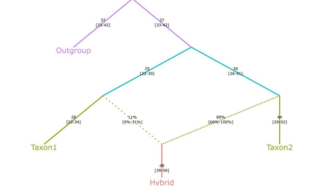
bootstrap[[2]] %>% summarize_fits() %>% plotly_graph(print_highlow = T)
Export file as SVG
You can now even evport the graphs to SVG format, yielding higher resultion and manipulation capabilities. The resulting file will be spawned in the working directory.
However, you need python to be installed and configured for this to work.
install.packages("reticulate")
library(reticulate)
reticulate::py_config()
reticulate::py_install("kaleido")
If it struggles you can try:
reticulate::use_python("C:/Path/To/Your/Python.exe", required = TRUE)
And then finally export the plot
final_plot = bootstrap[[2]] %>% summarize_fits() %>% plotly_graph(print_highlow = TRUE, fix=T)
save_image(file = "Bootstrap_Tree_Fit.svg")
If you encounter complications even after thoroughly reading this article, feel free to contact me.